
Mobile-First Design: Why It Matters for Your Business
Goktug Onyer
UX/UI Design Specialist
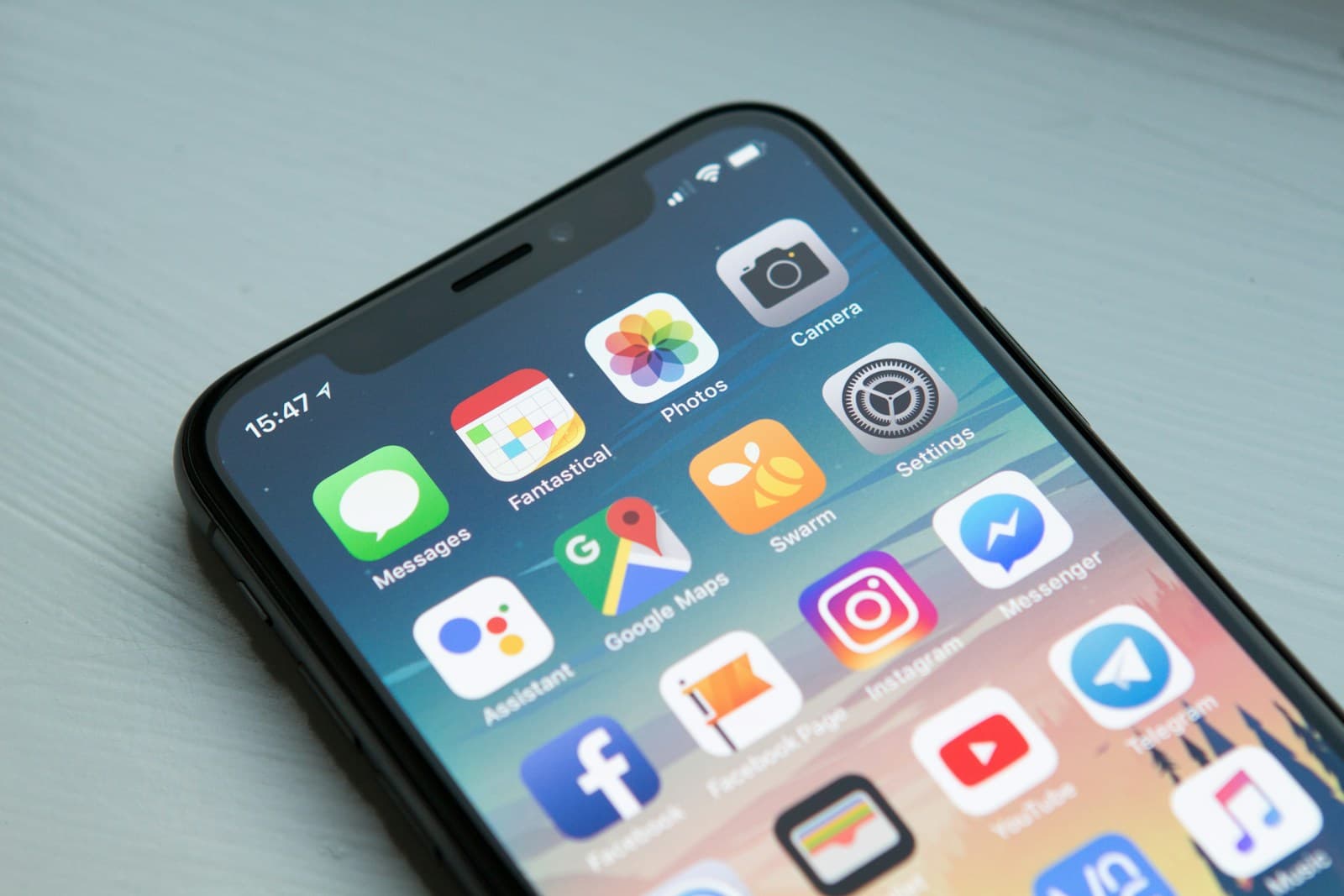
In today's digital landscape, mobile devices account for over 60% of web traffic globally. This shift has fundamentally changed how we approach web design, making mobile-first design not just a trend, but a necessity for business success.
What is Mobile-First Design?
Mobile-first design is a design philosophy that prioritizes the mobile experience when creating websites and applications. Instead of designing for desktop and then adapting for mobile, you start with the smallest screen and progressively enhance for larger devices.
The Business Impact of Mobile-First Design
Improved User Experience
Mobile-first design ensures that your website provides an optimal experience on the device your customers use most. This leads to higher engagement, longer session durations, and increased customer satisfaction.
Better Conversion Rates
Studies show that mobile-optimized websites can increase conversion rates by up to 64%. When users can easily navigate and complete actions on mobile devices, they're more likely to make purchases or engage with your business.
SEO Benefits
Google's mobile-first indexing means that your mobile site's performance directly impacts your search rankings. A mobile-first approach ensures better SEO performance and higher visibility in search results.
Key Principles of Mobile-First Design
1. Content Priority
Start with the most important content and features. Mobile screens have limited space, so you must prioritize what matters most to your users.
2. Touch-Friendly Interface
Design for touch interactions. Buttons should be large enough to tap easily, and interactive elements should have adequate spacing to prevent accidental taps.
3. Performance Optimization
Mobile users expect fast loading times. Optimize images, minimize HTTP requests, and use efficient coding practices to ensure quick load times.
4. Progressive Enhancement
Build a solid foundation for mobile, then add advanced features for larger screens. This ensures your site works well on all devices while taking advantage of desktop capabilities.
Common Mobile-First Design Mistakes
- Hamburger Menu Overuse: Don't hide important navigation behind a menu
- Small Text: Ensure text is readable without zooming
- Slow Loading: Optimize for mobile network speeds
- Complex Forms: Simplify input requirements for mobile users
- Horizontal Scrolling: Avoid forcing users to scroll horizontally
Implementation Strategy
To implement mobile-first design effectively:
- Research Your Audience: Understand how your customers use mobile devices
- Audit Current Performance: Analyze your existing mobile experience
- Start with Wireframes: Plan the mobile layout first
- Test Early and Often: Use real devices for testing
- Measure and Iterate: Continuously improve based on user feedback
The Future of Mobile Design
As mobile technology continues to evolve, we can expect new challenges and opportunities. Voice interfaces, augmented reality, and advanced mobile capabilities will shape the future of mobile-first design.
Key Takeaways
- Mobile-first design is essential for business success
- Focus on content priority and touch-friendly interfaces
- Optimize for performance and user experience
- Test on real devices and measure results
Newsletter
Get the next guide by email
Practical, no-pitch articles on AI, security, and software that lasts. A couple of emails a month, at most.
No spam, no sharing your address, unsubscribe anytime.
Related Articles

AI in SMBs: Automation Guide
Discover how small businesses can implement AI solutions to streamline operations.
Read More
Digital Transformation in Fitness
How fitness studios are using technology to enhance member experience.
Read More
eCommerce AI Personalization
Discover how AI is revolutionizing eCommerce with personalized experiences.
Read More